We Care Foundation helps underprivileged communities through education, healthcare, food, and shelter, spreading kindness and creating better futures.
Client Mr. Pradeep motwani
Services Branding indentity
Technology llustrator
CMYK : 0 85 98 0
RGB : 239 77 37
HSB : #EF4D26
CMYK : 92 58 52 36
RGB : 15 73 83
HSB : #0F4954
CMYK : 69 68 67 86
RGB : 13 3 0
HSB : #0D0301
CMYK : 33 7 28 0
RGB : 172 206 189
HSB : #ACCEBD
CMYK : 13 10 10
RGB : 219 219 219
HSB : #DBDBDB
CMYK : 0 0 0 0
RGB : 255 255 255
HSB : #FFFFFF
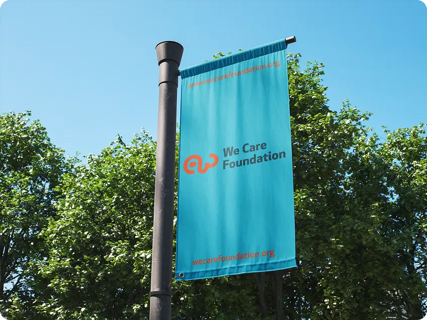
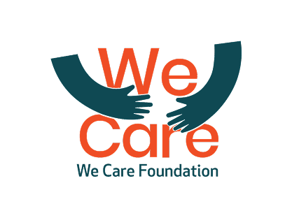
We Care Foundation needed a logo that truly represents their mission of helping and caring for people in need. The challenge was to visually express compassion, unity, and support in a simple yet powerful way, making it easily recognizable while reflecting the organization’s non-profit and charitable values.
We designed a meaningful logo featuring two hands forming a circle around the words “We Care,” symbolizing love, protection, and unity. The curved hands reflect the foundation’s core values of support and compassion, while the warm color palette conveys hope and positivity. This thoughtful design perfectly captures We Care Foundation’s mission to uplift communities and help those in need, creating a strong and memorable identity for their charitable and non-profit initiatives.
Apex New Trial
Hello,I am Apex New Trail Font
Hello,I am Apex New Trail Font
Hello,I am Apex New Trail Font
Hello,I am Apex New Trail Font
Hello,I am Apex New Trail Font
Hello,I am Apex New Trail Font
Hello,I am Apex New Trail Font
Hello,I am Apex New Trail Font

“Your vision, our creativity”
Together we build unforgettable brand success.
© 2025 Bigworks Design Studio All Rights Reserved.